Venn Diagrams: An Effective Tool for Visualizing Relationships
Venn diagrams are a visual representation of relationships between two or more sets of data. They are used to illustrate how different groups overlap and intersect with each other, allowing us to gain insight into the similarities and differences between them. Venn diagrams can also be used to represent complex ideas in an easy-to-understand manner. By using circles that overlap one another, we can clearly see the connections between various concepts and quickly identify any discrepancies. With its simple yet powerful design, Venn diagrams have become an invaluable tool in problem solving, decision making, and many other areas of life.
Venn Diagrams are used in many fields to help analyze data sets and form meaningful conclusions. In mathematics, they are used to illustrate basic concepts like set theory. In biology, they’re used to show the similarities and differences between different species. In business, they can be used to compare customer segments or market segments.
Different kinds of Venn Diagrams
There are many different types of Venn diagrams that can be used to illustrate the relationships between two or more sets of data. The most common type is a two-circle diagram, which consists of two overlapping circles that represent two distinct sets of data. It is often used to show the similarities and differences between the two groups. There are also three-circle diagrams, which consist of three circles that represent three distinct sets of data. This can be used to compare the relationships between three different groups or categories. Additionally, Venn diagrams can also be adapted for larger datasets by adding additional overlapping circles.
Elements of a Venn Diagram
The most common type of Venn Diagram has two overlapping circles, each representing a different set of items. The overlapping area in the middle represents the elements shared between both sets. Additionally, the non-overlapping areas represent the elements that are unique to each set.
Venn Diagrams can also have more than two circles, creating numerous possibilities for the comparison of variables. Each circle can represent a different factor such as age, location, or gender and the overlapping areas provide insight into the relationships between those factors.
Unions and Intersections in Venn Diagrams
In a Venn diagram, the union is when two or more sets are combined to create a single set that includes all of the individual elements from both sets. This is typically represented in diagrams as an area where two or more circles overlap and the overlapping region encompasses all items contained within both circles. The union of two sets can be thought of as the combination of all elements from both sets, and it is represented by the symbol U.
In a Venn diagram, the intersection is when two or more sets are combined to create a new set that contains only items that are in common between them. This is typically represented in diagrams as an area where two or more circles overlap and the overlapping region only includes items contained within both circles. The intersection of two sets can be thought of as the overlap between them, and it is represented by the symbol ∩.
For example, if Set A contains elements 1, 2, and 3 and Set B contains elements 2, 3, and 4 then the union of these two sets (A U B) would contain elements 1, 2, 3, and 4. Meanwhile, the intersection of these two sets (A ∩ B) would only contain element 2 and 3.
All Venn diagrams can be written in terms of unions and intersections so it is important to understand the meanings and symbols associated with each operation. Once you understand how the union and intersection of sets are represented in diagrams, you can use them to solve a variety of math problems.
How Venn Diagrams Are Used in Business
Venn diagrams are an incredibly powerful visual tool that can be used to facilitate better decision-making and improved communication in business. A Venn diagram is a graphical representation of the relationship between different sets of data or concepts. By visually mapping out the overlap between two or more topics, Venn diagrams allow for quick and easy identification of relationships between different sets of data. They can be used to compare and contrast different topics, to identify commonalities between disparate ideas, and to brainstorm new ideas or solutions. Venn diagrams are particularly useful for highlighting shared information or similarities in complex datasets.
Venn diagrams also provide a simple way to represent large amounts of data in an easy-to-understand format. By displaying data in a Venn diagram, users can quickly identify commonalities between different sets of data and make more informed decisions based on this information. In addition, the visual nature of Venn diagrams makes it easy to explain complex concepts to non-experts or those who do not have an understanding of the underlying data.
Venn diagrams can also be used to illustrate relationships between different sets of data or concepts.
Venn diagrams are a valuable tool for any business and can help to simplify decisions, create clarity in communication, and generate meaningful insights. With the right approach, Venn diagrams can be an invaluable asset when it comes to improving decision-making and communication. With the right data and a bit of creativity, Venn diagrams can be an effective tool for unlocking the potential of any business.
The possibilities for using Venn diagrams in business are endless. From comparing customer demographics to analyzing financial data, Venn diagrams provide a visual way to compare and contrast different datasets. They can also be used to visualize relationships between products, services and customers, or even to brainstorm new ideas. By combining the power of graphical representation with the insights gained from data analysis, Venn diagrams can be a powerful tool for any business.
In short, Venn diagrams are an incredibly valuable asset that can help businesses make better decisions and communicate more effectively. With the right data and the appropriate approach, Venn diagrams can open up a world of insights that can help any business reach its goals.
How Venn Diagrams Are Used for Strategic Planning
Venn diagrams provide a visual tool for strategic planners to identify, analyze, and interpret data related to the decision making process. By plotting data points that share common characteristics in two or more circles, the interconnections between data sets can quickly become apparent. This is especially useful when considering multiple scenarios in order to create detailed and actionable plans. Venn diagrams are also useful for understanding the relationships between different components of a system or process. By plotting multiple data points, it becomes easier to identify areas that need improvement and to visualize potential solutions. Additionally, with Venn diagrams, strategic planners can quickly identify patterns in the data that may not have been immediately apparent when looking at raw numbers or equations. This allows strategic planners to make more informed decisions and craft better strategies. Venn diagrams can also provide insight into the tradeoffs associated with different solutions or strategies, allowing for further analysis and refinement of plans. Finally, Venn diagrams are useful in identifying trends or patterns within a dataset that may not be immediately obvious, helping inform decisions and anticipate future outcomes. Ultimately, Venn diagrams provide a powerful visual tool for strategic planners to quickly identify, analyze, and interpret data in order to make better decisions. As such, they are an invaluable tool for any organization looking to craft effective strategies and develop successful plans.
By combining the power of visualization with the ability to plot multiple data points and analyze relationships, Venn diagrams provide an inexhaustible resource for understanding data and creating actionable plans. With a few simple circles combined with some thoughtfully placed data points, strategic planners can quickly identify complex patterns, anticipate future outcomes, and refine their plans to better meet their goals. By utilizing the power of visualization and making use of a Venn diagram, strategic planners can gain a better understanding of their data and make more informed decisions.
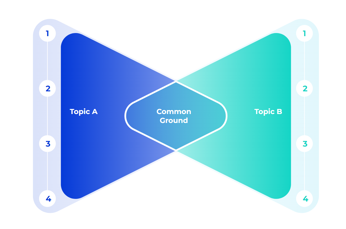
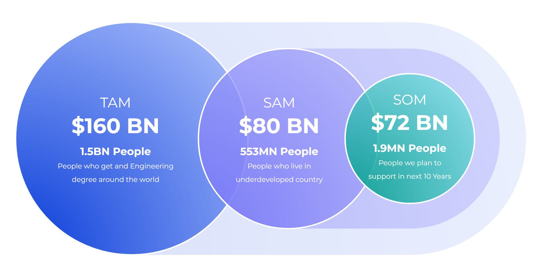
Examples of Venn Diagrams
Venn Diagrams come in all different designs. Below are a few of my favorite templates I use.


Venn diagrams are an extremely useful tool for organizing information and making sense of complex topics. They are easy to create and read, making them a great tool for communication. With their diverse applications, Venn diagrams can be used in many different disciplines such as mathematics, statistics, science, philosophy, business, and more. By uncovering the relationships between sets of data and ideas quickly and accurately, Venn diagrams make it easier to gain a better understanding of the world around us.
No matter what your field of study or interest may be, Venn diagrams are a powerful tool to have in your arsenal. Whether you’re trying to find patterns in data sets or compare different concepts, Venn diagrams can help you make sense of it all. With its simple yet powerful design, Venn diagrams are an invaluable tool for problem solving and decision making.
So the next time you’re stuck trying to make sense of a complex topic or data set, don’t forget about the power of Venn diagrams! They can help you quickly identify connections between different sets of data and gain deeper insights into the world around us. Take advantage of their simplicity and power by using them in your work today!